Giving Table
A mobile app designed to help people engage in charitable giving to relieve families and individuals struggling with food insecurity.
Problem & Objective
Users want to engage in charitable giving to relieve families and individuals struggling with food insecurity. They need their efforts to have a direct impact on those within their local community and support local businesses in the process.
The objective of The Giving Table is to provide community outreach to address food insecurity by utilizing local businesses and resources to not only benefit those in need but, in addition, support the local economy. The Giving Table provides the ability for donors to contribute food to individuals within their local community through their local community grocers. Grocers provide various packages at discounted rates and deliver food packages using local delivery services. All recipient recommendations are vetted through The Giving Table intake process. Donors may make a one-time or recurring gift and all recipients are kept anonymous.
Competitive Analysis
As part of the discovery process, I conducted a competitive analysis to evaluate the most recognized non-profit in the market. Meals on Wheels is the primary organization that provides services for those dealing with food insecurity. In this discovery, I queried the local Meals on Wheels affiliate and identified some challenges and valuable features related to their site.
User Base & Research
69% of donations are made by women.
77% believe everyone can make a difference by supporting causes
69% of population gives.
Charitable growth occurring in human services (+5.1%) and public-society benefit organizations (+7.8%).
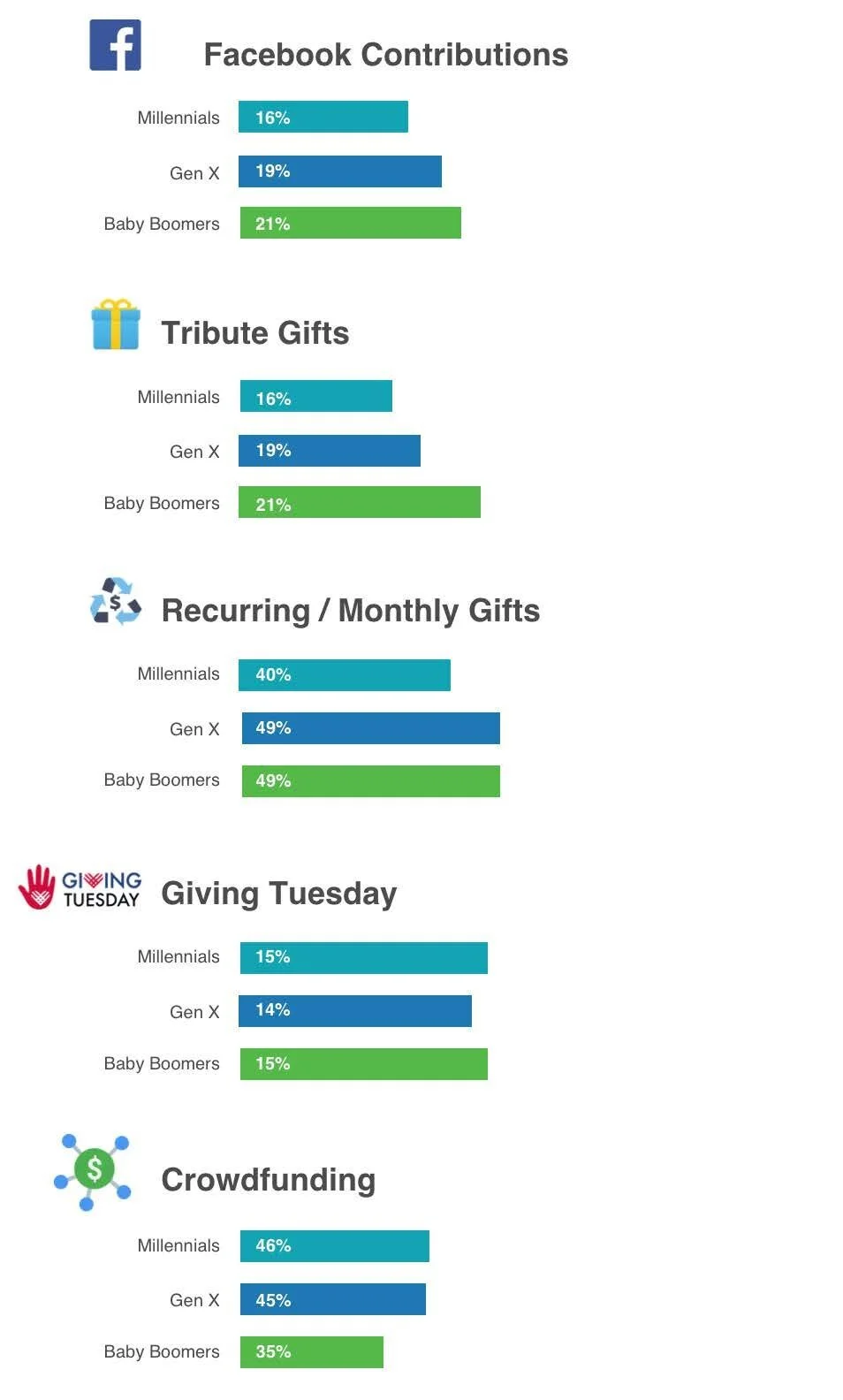
84% of Millennials donate an annual average of $481
11% of US giving comes from Millennials
72% of Boomers donate an annual average of $1,212
Boomers are most likely to make recurring donations

Challenges
The site serves as a hub for individual organizational sites. The experience is a lack of consistency and usability due to the design format.
The local landing page is confusing and the donation button is difficult to find
Several gift options are provided but there is no sense of where the donation is going or who is impacted.
The crowdsourcing option is unclear and no explanation is provided
3rd party payment portal is used and payment options are unclear. User has to click through each option to evaluate which one they would prefer.
Gift selection interaction is confusing. The user selects a gift amount and is immediately taken to the payment section. There is no opportunity to see if the selection is confirmed.
Valuable Features
Social media integration
Crowdsourcing option
Gift variance
Custom gift option
Recurring/One Time option
Tribute gift option
Recent donation feed
Overview/Persona
Primary users will likely be a female representation from each demographic as all three generational categories are pro-active donors. The user will desire the ability to discover opportunities and integrate their activities through social media. For convenience, they will want the option to schedule recurring gifts, make tribute gifts, and share their giving experience via social media. To accommodate the income variance from Millennials to Baby Boomers, an assortment of gift pricing options should be provided. Users would like the ability to receive confirmations and receipts via text messaging. The user wants the satisfaction of making an impact on the life of someone within their local sphere. Crowdfunding initiatives are seen as an opportunity to participate in a community effort and provide a viable return.
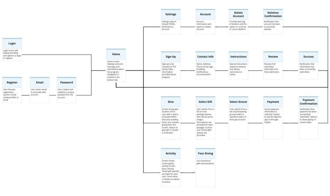
User Flow
After my initial analysis and determining a list of requirements, I designed and laid out the initial user flow for the application.
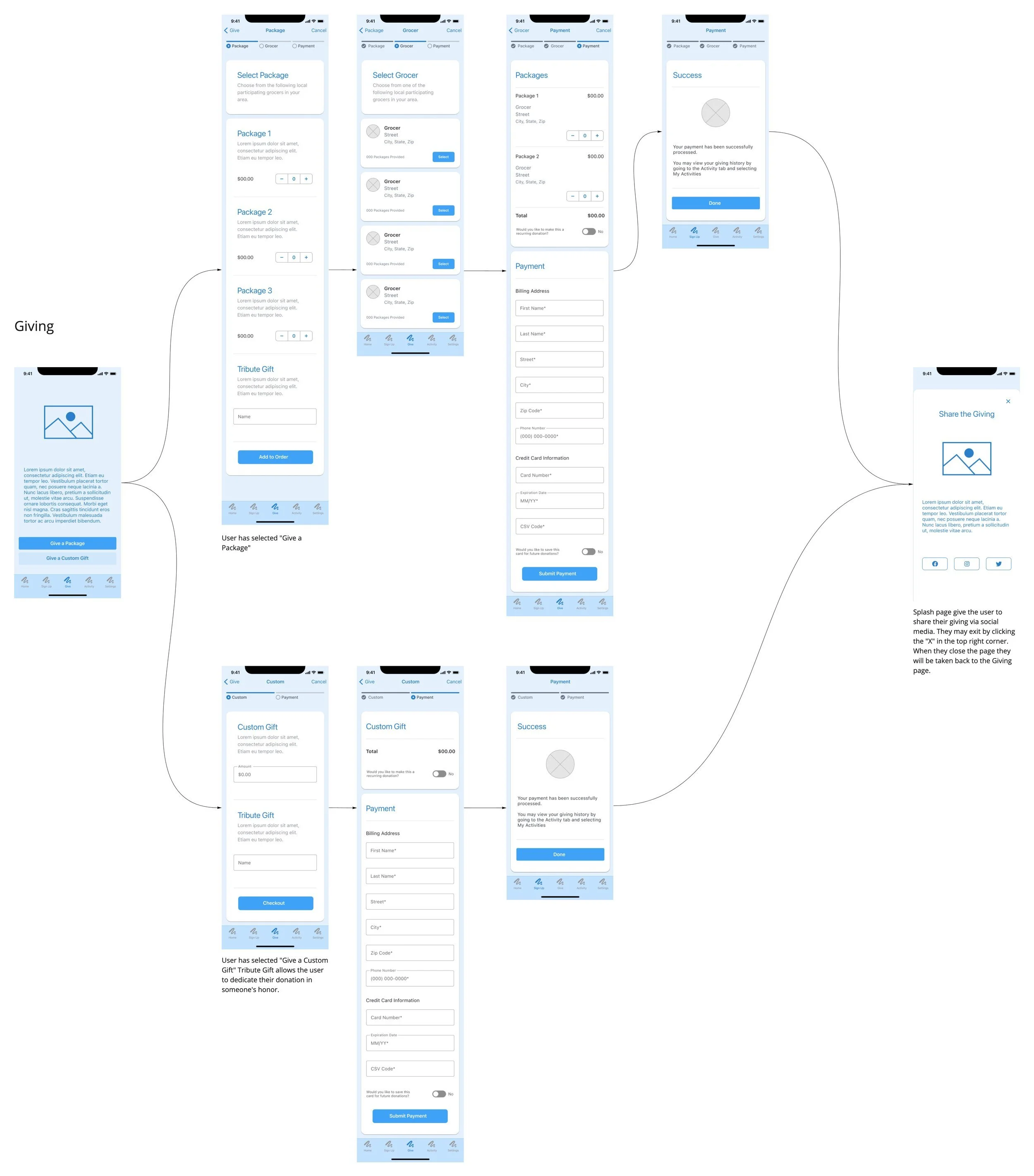
Lo-Fidelity Wireframes
Next, I created low-fidelity wireframes to evaluate flow, interaction, and features. User feedback was gathered to validate and iterate improvements to the design.
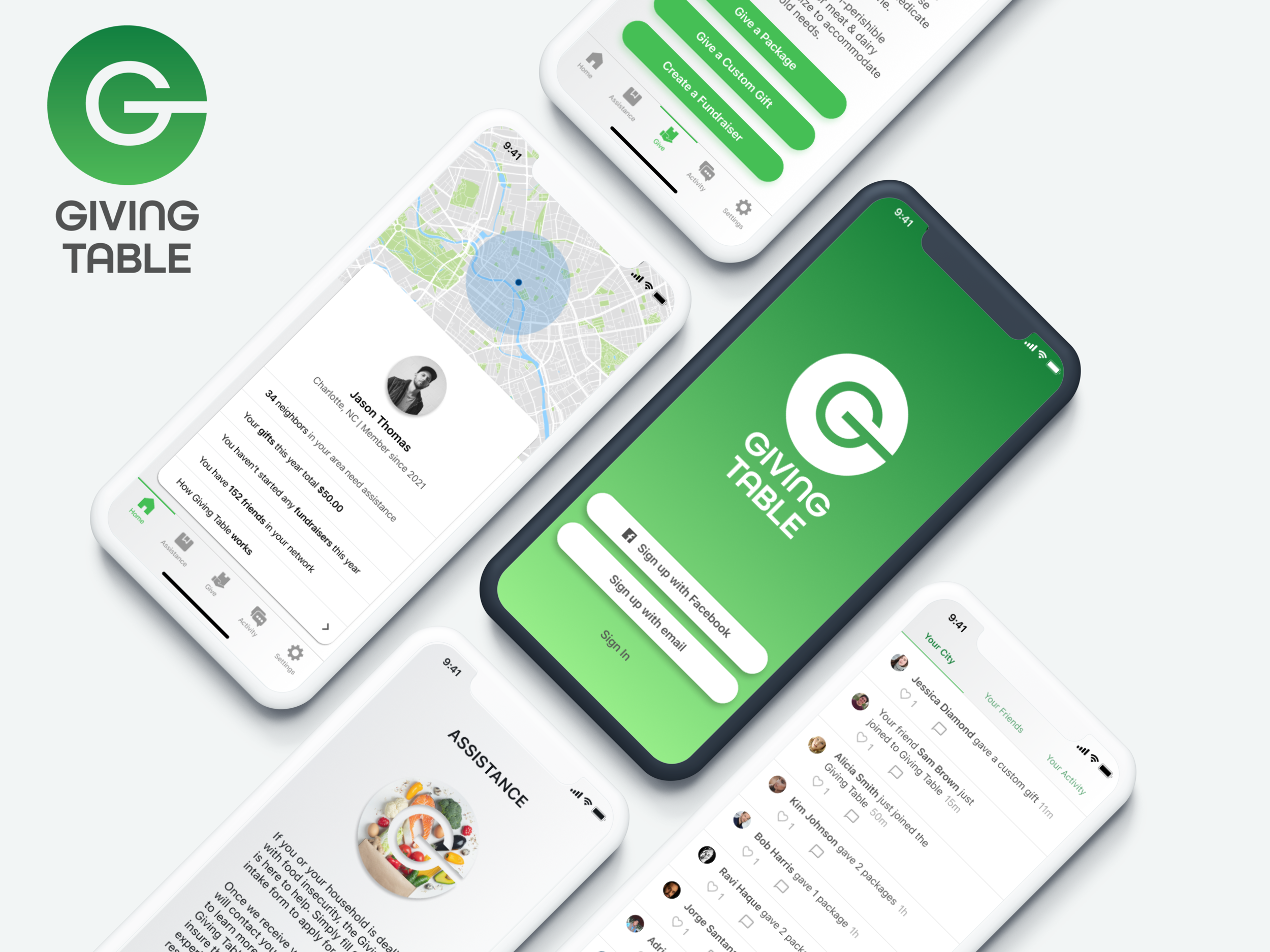
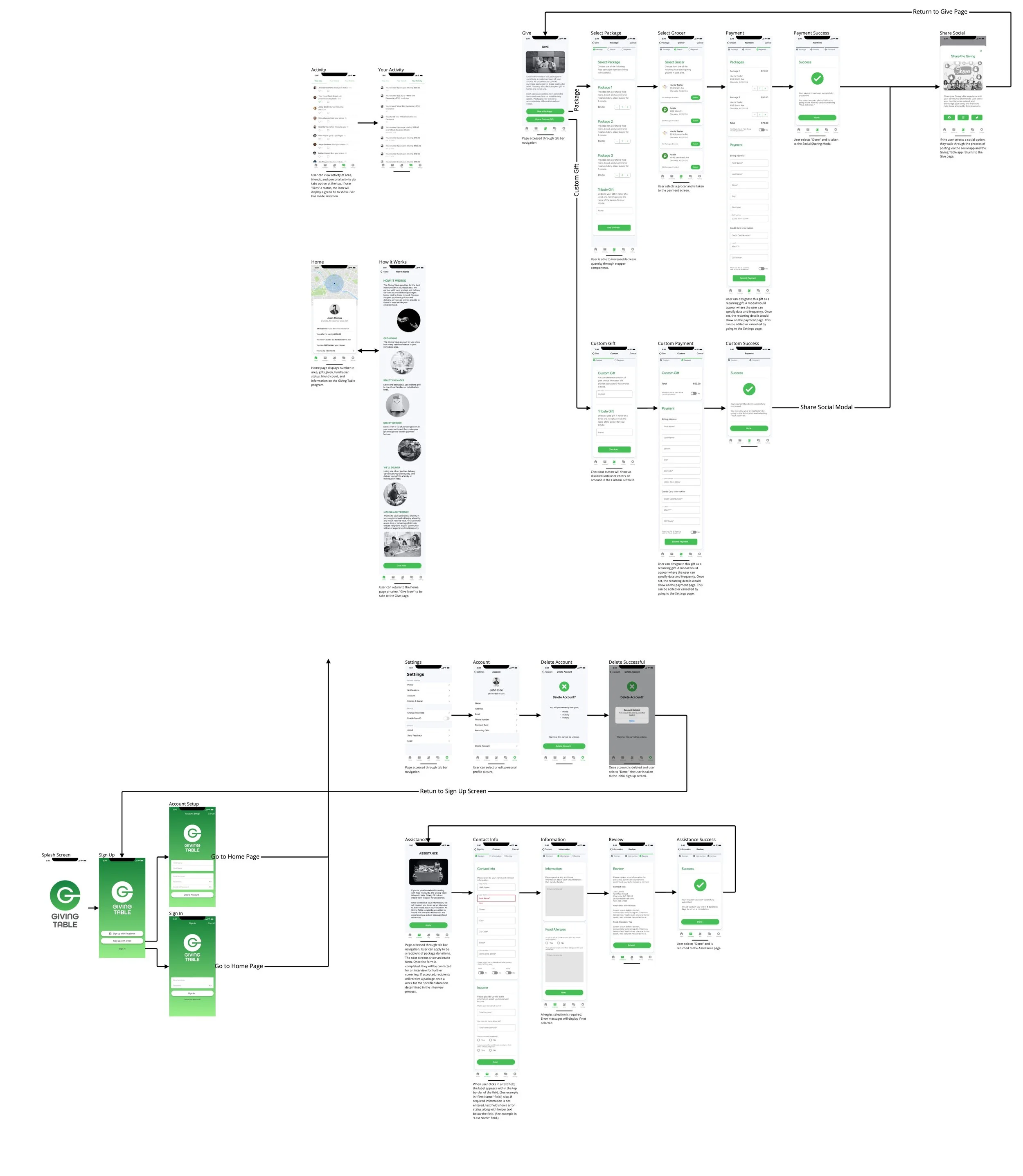
High-Fidelity Wireframes
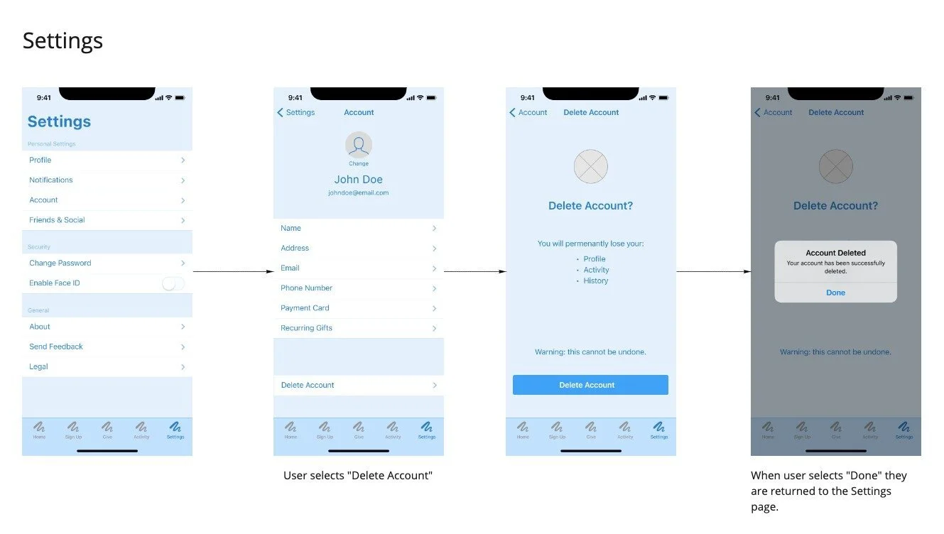
After making improvements to the initial design, I created high-fidelity wireframes for final review. Research showed that some nomenclature needed to be revised for clarity, the user flow for Delete Account needed to be adjusted, and the Activity feed needed to be revised to be consistent with functionality.
Challenges & Results
What went well?
Users found the interaction and user flow to be intuitive and simple in its function resulting in a desirable and viable user experience.
What didn’t go well?
It wasn’t clear how users would comment in the activity section. I had to go back and redesign the activity section to accommodate user comments. Also, users were confused by the different categories within the Activity section. This was due to some labels that needed to be revised for better clarity.
What can be improved?
More functionality needs to be designed, specifically the Fundraising user flow. The payment portal would need to be improved to accommodate SSL requirements for payment. User flows for the social media integration need to be designed and evaluated for feasibility as it pertains to posting functionality. Also, I would like to conduct further research on the non-profit business model to evaluate its feasibility.
What was learned?
The research of this project helped to broaden my perspective on the giving habits of various demographics. Having worked in various non-profits most of my career, I can see the correlation between statistics and my personal experience. This also provided the opportunity to incorporate some new UI and prototyping techniques that will benefit my future design work.